


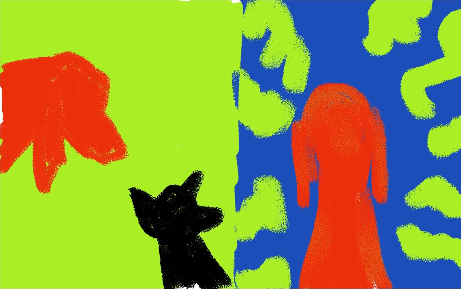
Using the sketch I started to play with colours. But it never felt right. I wanted the scary page to be full of clashing colours and conflict, but it never sat right with the other page.

I am not proud of this page, and it was never really meant for general consumption, but it’s needed here – so I apologise for its crumminess!
Next I changed my colour scheme for the dogs a bit, bringing them into a more natural realm. However I tried to keep the bright green and blue.
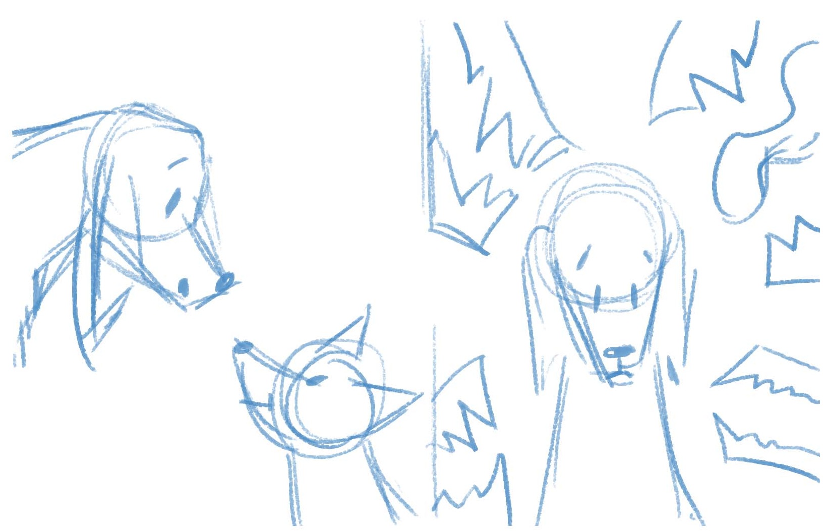
After completing it I wasn’t happy and left it for a while, wondering how to fix it. I knew it didn’t work as I wanted it to – painting technique aside, Liffey looked sad rather than scared, and the monsters seemed like an afterthought. So I started sketching out ideas in my notebook giving the monsters more precedence.

So this is what I painted yesterday. I’m pleased with it as a piece (though of course there’s always things to nitpick) but I still wasn’t happy with the page. Liffey sure looked scared, but it felt TOO scary. After all, it’s supposed to be a light-hearted children’s story …
It was when I was taking a bath yesterday evening (baths and walks are fantastic for coming up with ideas) that I finally realised where I’d been going wrong. Somehow I’d forgotten all about the words on the page: “Liffey … thought she was a small dog.” I’d moved away from “small dog” to “scared dog”, even though her fear of other dogs is addressed on the next page in a much clearer way.

This is my latest idea: much simpler and, I think, much clearer. It fits so much more with the words and will sit better with the other page in the spread.
Now just twenty-one more pages to go …
0 Comments